Table of contents
Media queries:-
it is used to give the proper design structure for our document to different sizes of screen and more like for mobile, tablet and Desktop basically for these three and many more also we can decide how will my website will look at this three platforms.
the syntax starts with @ media (not any space) and then the type of media as shown in the above cover image
Add a breakpoint:-
Media queries can help with that. We can add a breakpoint where certain parts of the design will behave differently on each side of the breakpoint. You can add as many breakpoints as you like.
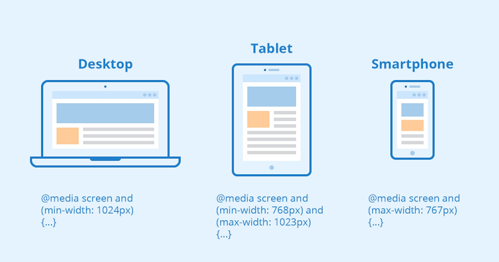
Media types:-
Media types define the broad category of the device for which the media query applies: all, print, screen. The type is optional (assumed to be all) except when using the not or only logical operators.
Output for Different types of the screen...
//OTHER SCREEN
body{
background-color:antiquewhite;
}
nav{
display: flex;
flex-direction: row;
justify-content: space-around;
align-items: center;
color: green;
font-weight: bolder;
}
.logo{
height: 40px;
width: 100px;
}
main{
display: flex;
flex-direction: row;
flex: 1;
}
.col{
display: flex;
flex: 0.5;
min-height: 100%;
justify-content: space-between;
}
h1{
font-family: Arial, Helvetica, sans-serif;
font-weight: bolder;
font-size:xx-large;
}
.col-1{
margin-left: 75px;
}
.image{
height:490px;
display: flex;
margin-top: 6px;
}
footer{
background-color: aquamarine;
display: flex;
flex-direction: row;
justify-content: space-around;
align-items: end;
font-weight: bolder ;
}
//TABLET SCREEN
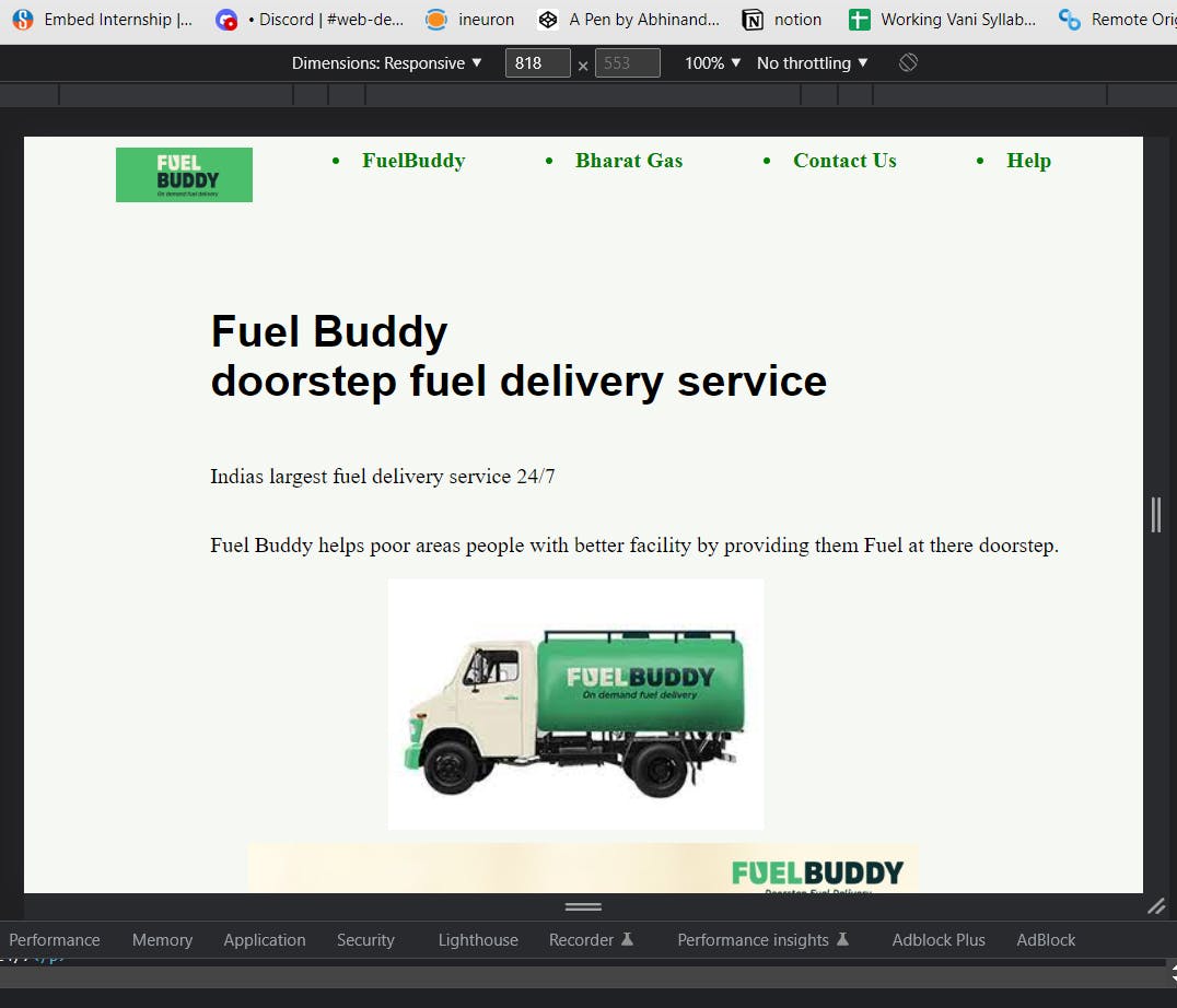
@media screen and (max-width: 1023px ) and (min-width: 768px) {
body{
background-color: rgb(246, 248, 244);
}
nav{
display: flex;
flex-direction: row;
justify-content: space-evenly;
align-items: start;
}
main{
display: flex;
flex-direction: column;
align-items: center;
}
.one{
display: flex;
flex-direction: column;
align-items: flex-start;
margin-top: 50px;
}
.fd{
position: relative;
left: 130px;
}
}
//MOBILE SCREEN
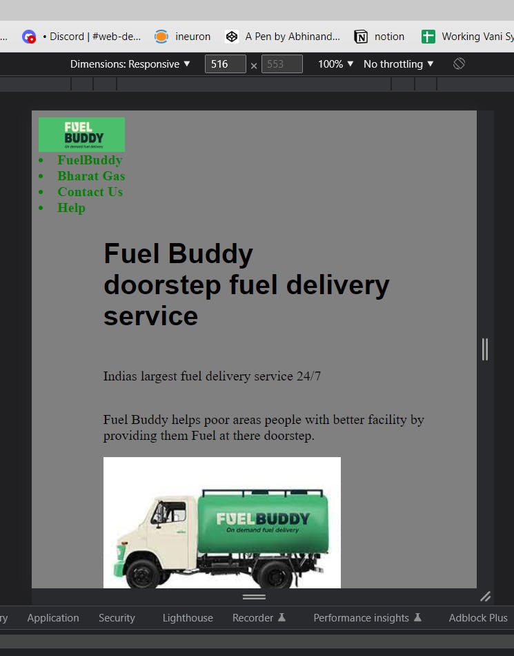
@media screen and (max-width: 767px ){
body{
background-color: grey;
}
.image{
height: 300px;
}
nav{
display: flex;
flex-direction: column;
justify-content: center;
align-items: start;
}
main{
display: flex;
flex-direction: column;
align-items: center;
}
.one{
display: flex;
flex-direction: column;
justify-content: center;
margin-right: 30px;
}
}
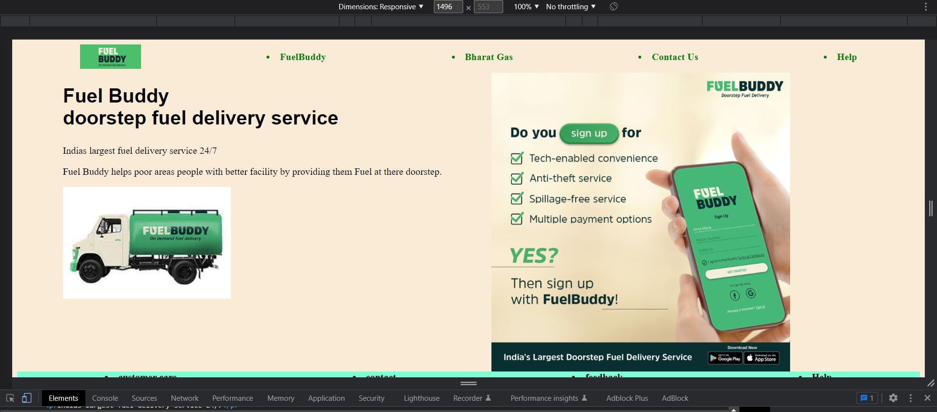
1)FOR DESKTOP SCREEN
2)FOR TABLET SCREEN
3)FOR MOBILE SCREEN