

1)Flexbox:-
it is a one-dimensional layout model for documents means when we call flexbox it will deal with only one dimension at a time either as a row or a column. it offers two powerful methods i.e space distribution between the items and alignment capability.
Two Axes of flexbox(Main & Cross):-
when learning this flexbox we need to know the main two axes of flexbox. The main axis is defined by the flex-direction property, and the cross-axis runs perpendicular to it.
1)Main Axis:
The main axis is defined by flex-direction, which has four possible values: row, row-reverse, column, and column-reverse.
when you choose row or row-reverse in the flex-direction then the main axis will run along the row in the inline direction.
when you choose column or column-reverse in the flex-direction then the main axis will run from top to bottom in the block direction.
2)Cross Axis:
The cross-axis runs perpendicular to the main axis like opposite to main axis.
If your flex-direction (main axis) is set to row or row-reverse the cross-axis runs down the columns.
If your main axis is column or column-reverse then the cross axis runs along the rows.
The Flex Container:-
The area of the document which is affected by flexbox is called Flexbox Container. to create the flex container we used keywords display and set the values to flex or inline-flex. as soon as we set to display the direct children under that area(eg-to div, main, section etc) becomes flex items.
.div{ display: flex/inline-flex}
Changing Flex Direction:
by default, the direction of flex item is row along with the left side as a starting edge for the alphabet and the right side as starting edge for urdu .
We can change the direction of Flex items by using flex-direction
1)default- flex-direction is a row.
- flex-direction: row-reverse -->it will start the items from the right side of the document
3)flex-direction: column --> will change items to in the direction of the column as the main axis switched to perpendicular.
4)flex-direction: column-reverse --> will change items into columns but the starting point will be from the bottom side.
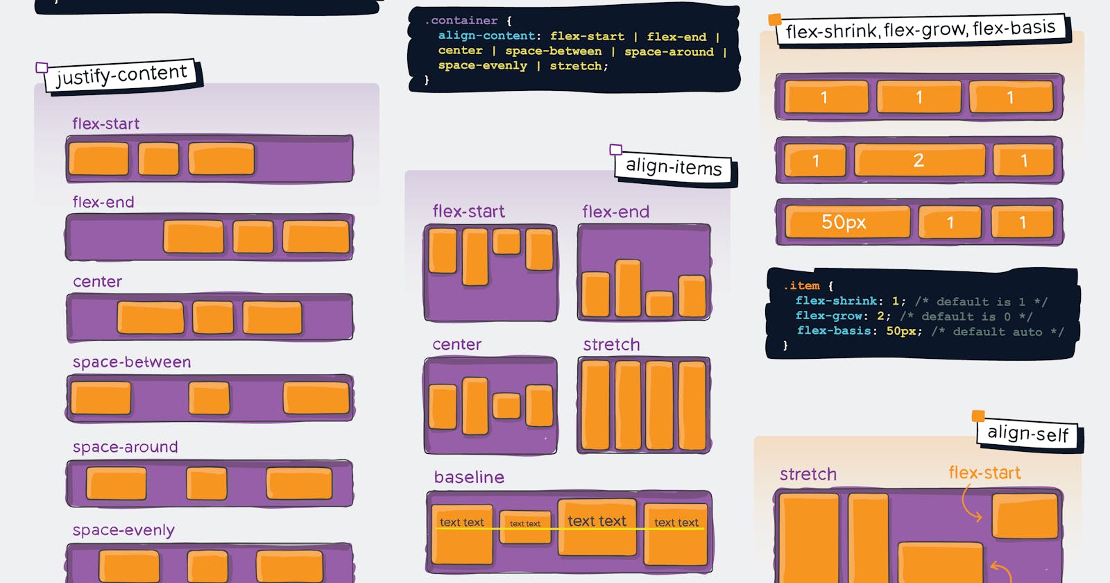
Alignment, Justification and Space distribution property in the flexbox:-
1)align-items:-
the align-items property will align the items on the cross-axis i.e opposite direction to the flex-direction is set. this property should be only applied on the flex container, not on the items.
suppose the flex-direction is a row then the main axis is inline with row that means cross axis is perpendicular to the main axis so when we applied align-items property it will work on the items vertically.
there are a few properties of align-items alignment.
1)align-item: flex-start --> it will align all the items equally at the top of the flex container.
2)align-item: flex-end --> it will align all the items equally at the bottom of the flex container.
3)align-item: centre --> it will align all the items equally at the middle/centre of flex container or vertically.
2)Justify-content:-
the justify-content property will align the items on the main axis in the direction in which the flex-direction property is set.
there are a few properties of justify-content alignment.
1)justify-content: flex-start --> it will line up all items from starting edge of the container.
2)justify-content: flex-end --> it will line up all items from the ending edge of the container.
3)justify-content: centre --> it will line up all items at the centre of the row.
4)justify-content: space-between --> it will make equal space between the items.
5)justify-content: space-around --> it will make equal space around items means from both sides the space will be the same.
6)justify-content: space-evenly --> it will make evenly space around them.